hobbs.design v5 · components
Built to be adopted.
This page is the component layer running live. The hero you're reading is the index-hero organism. Everything below consumes semantic tokens, and nothing reaches past them.
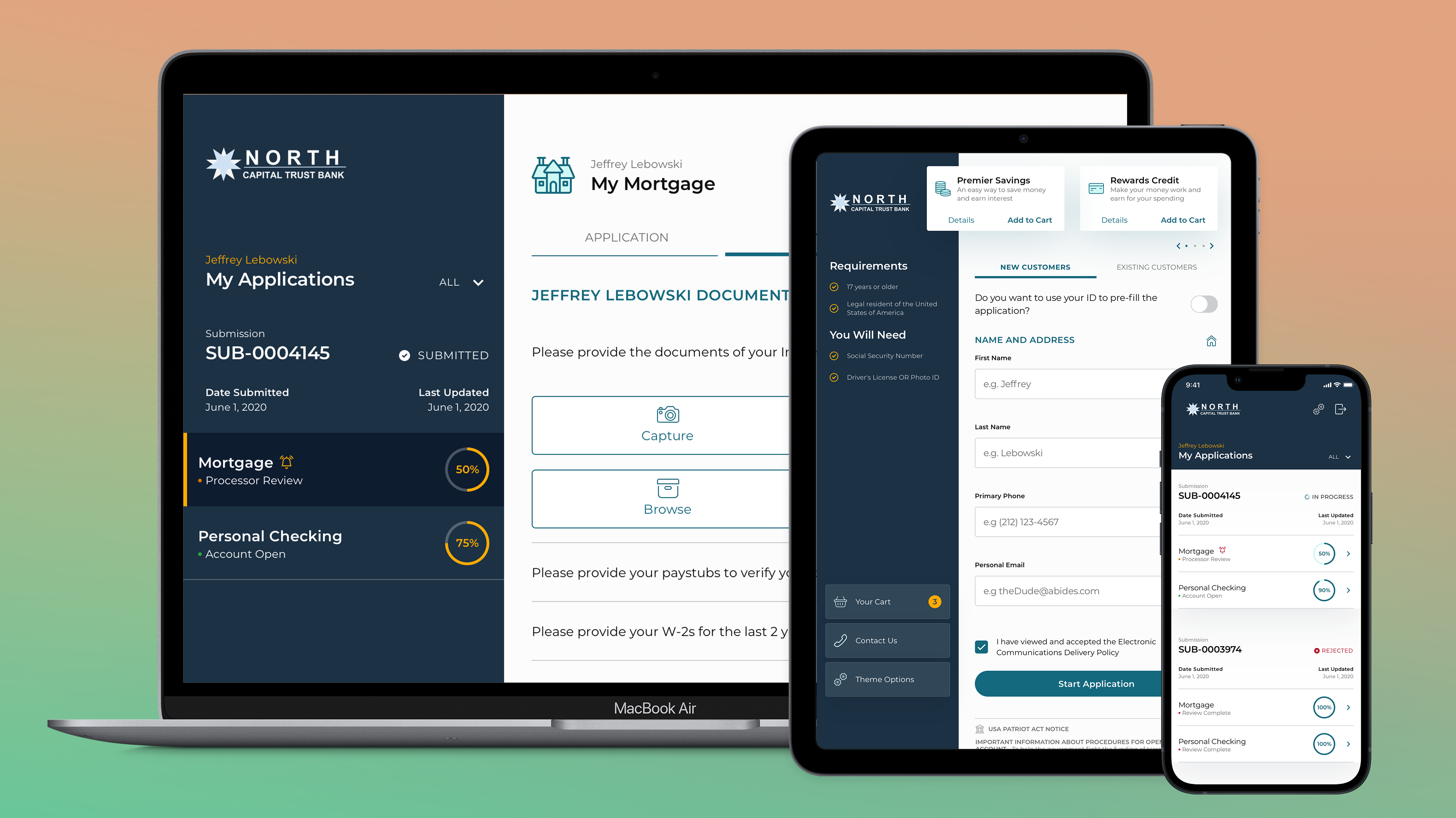
Case study hero
Two surfaces, one component. The inverse variant swaps four custom properties and touches no rules. Muted text on onyx uses a 70% knockout that measures 6.6:1.
Union Home Mortgage
A design system for a team of backend engineers.
The emphasis was on making the system easy to adopt. Something the team could rely on, not something they had to interpret.
Terafina, Inc.
Clarity was missing at every level.
A rebuild that started at atomic elements and let the decisions scale. Completion rates improved 12%.
Form fields
Labels stay visible, errors are announced through aria-describedby, and the error message spells out the word instead of leaning on red alone. A specimen, not a working form — the site takes contact by email rather than by post.
Enter an email address with an @ in it.
Helps me read up before we talk.
Chips
Informational labels. Neutral by default, feedback tints for status. No red: the accent belongs to links and CTAs, and a chip is neither.
Icons
Bootstrap Icons (opens in a new tab),
held as an SVG sprite at src/public/icons.svg and pulled in by
reference — no icon font, nothing to bundle. Reserved for arrows and other
non-letterform marks; never for anything a word can say on its own.
To use one: <svg class="icon" aria-hidden="true"><use href="src/public/icons.svg#bi-{name}"></use></svg>
with any icon name from Bootstrap Icons, then run npm run build:icons — it
scans the site for #bi-{name} references and pulls just those symbols out
of the full library. Nothing to copy or paste by hand.