The team was building fast. There was no system to support it.
Union Home Mortgage was building a set of internal applications to replace parts of a larger, more complex lending platform.
Each tool was being developed independently, with little shared structure or consistency across the experience. As the number of applications grew, so did the gaps between them.
Consistency didn't exist
across the applications.
Interfaces varied widely from one application to another, with no shared patterns for layout, hierarchy, or interaction. For a team made up primarily of backend engineers, usability and presentation weren't a primary focus, leading to inconsistency and added cognitive load for users.
Without a shared structure, every decision had to be made from scratch. That made the applications harder to build, harder to scale, and ultimately harder to use.
The work focused on creating a system the team could actually use.
The goal was to introduce a shared foundation that would bring consistency to the UI, reduce decision-making overhead, and make it easier to build new applications.
That meant rethinking the presentation layer, simplifying application flows, and introducing a more flexible system for branding and configuration.
Design was not prioritized
The team had been focused on functionality only
The system needed to be practical, not theoretical.
A UI kit and design system were created to support real development workflows, focusing on reusable components, clear patterns, and straightforward implementation.
Working closely with a backend-focused team, the emphasis was on making the system easy to adopt—something the team could rely on, not something they had to interpret.
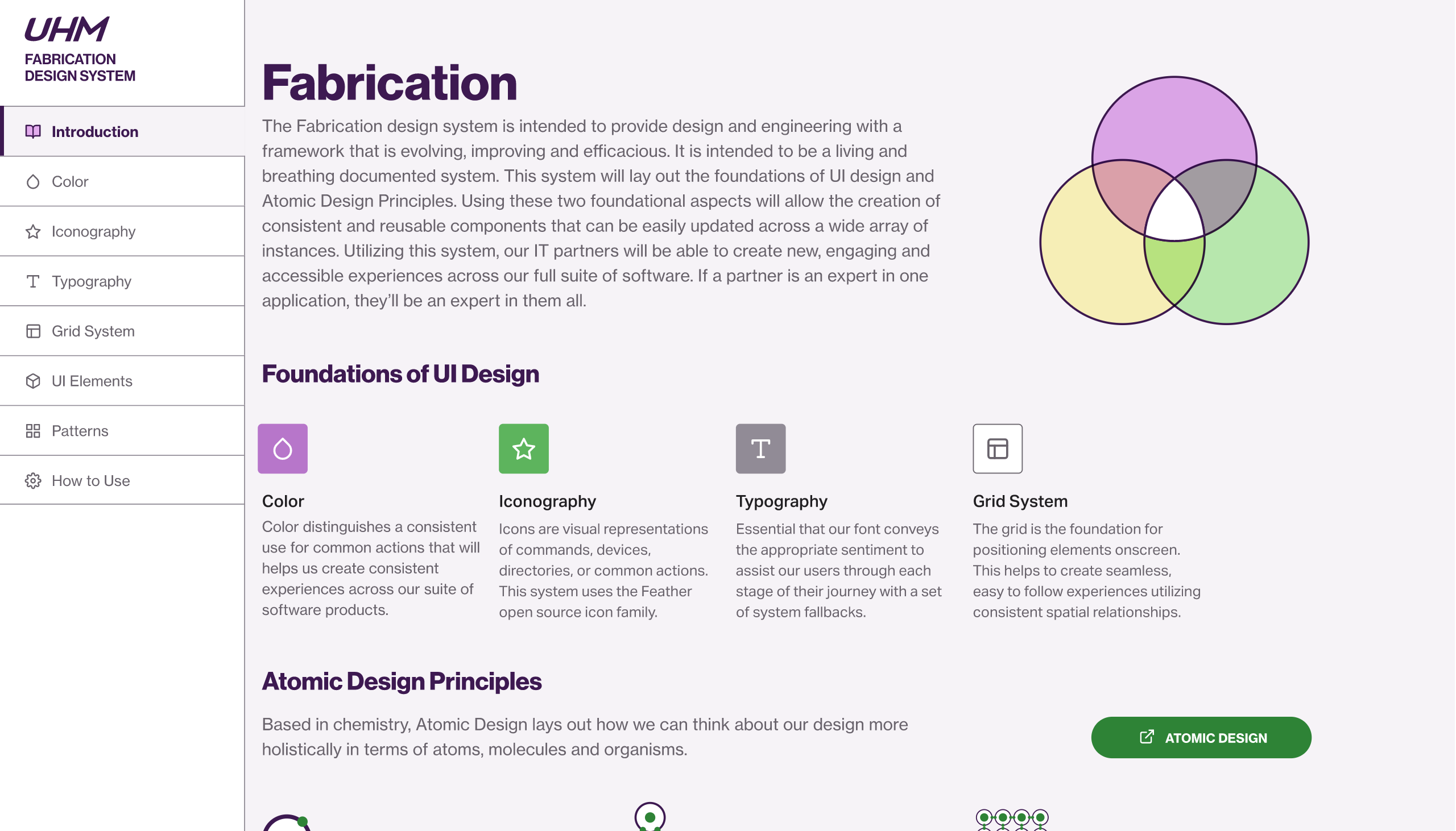
Atomic Design Principles
Utilized a modular approach to design, breaking down interfaces into fundamental components to ensure consistency and reusability.
Grid System
Vital to all layouts, the grid system provided a consistent structure for organizing content and ensuring visual harmony across applications.
Typography
Selected a grotesk sans-serif typeface prioritizing legibility and scalability, establishing clear typographic hierarchies to guide users through data-heavy content.
Color Palette
Developed a shared color scale using the brand's primary and secondary colors, along with a complementary tertiary palette. Automated tools ensured WCAG 2.0 contrast ratios of 4.5:1 for accessibility compliance.
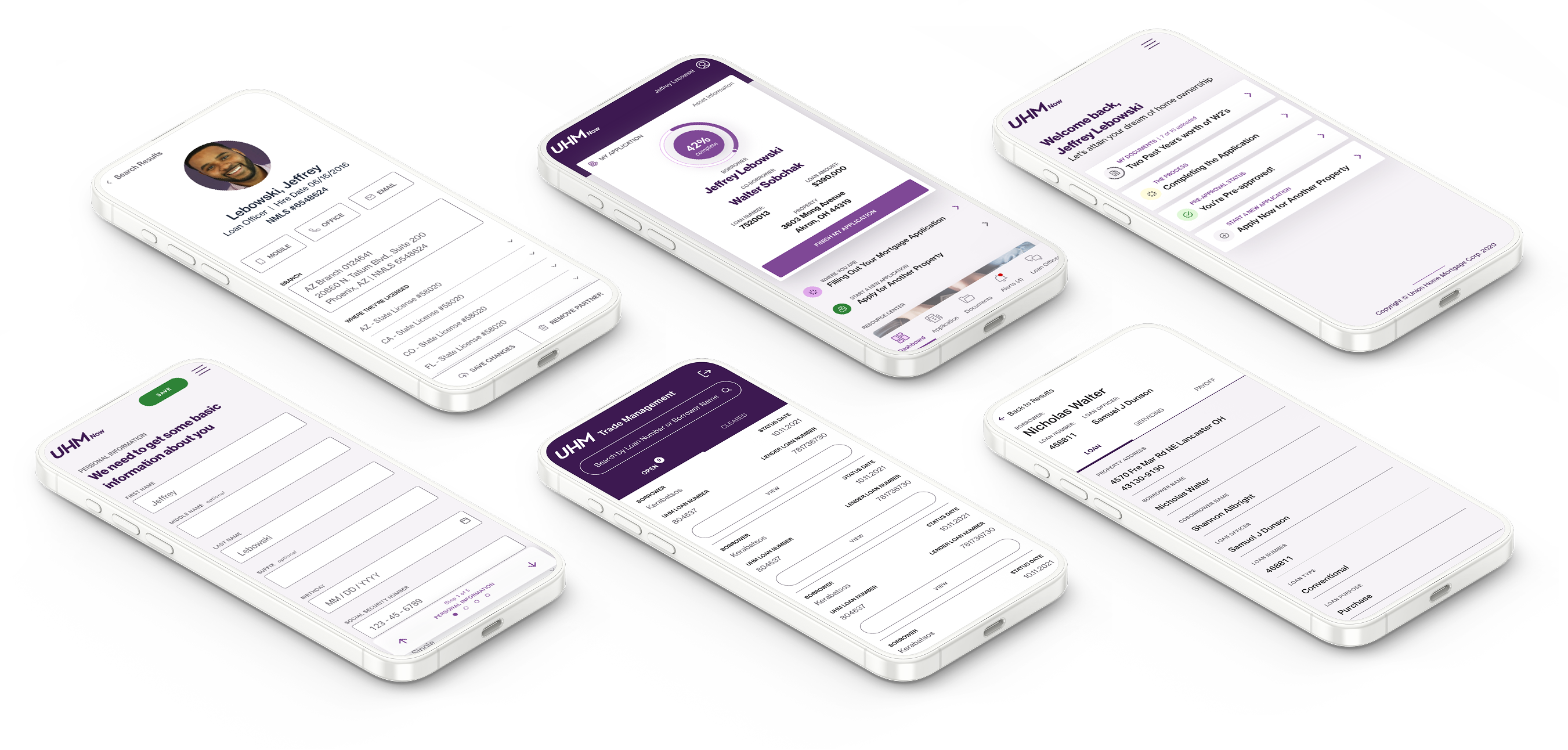
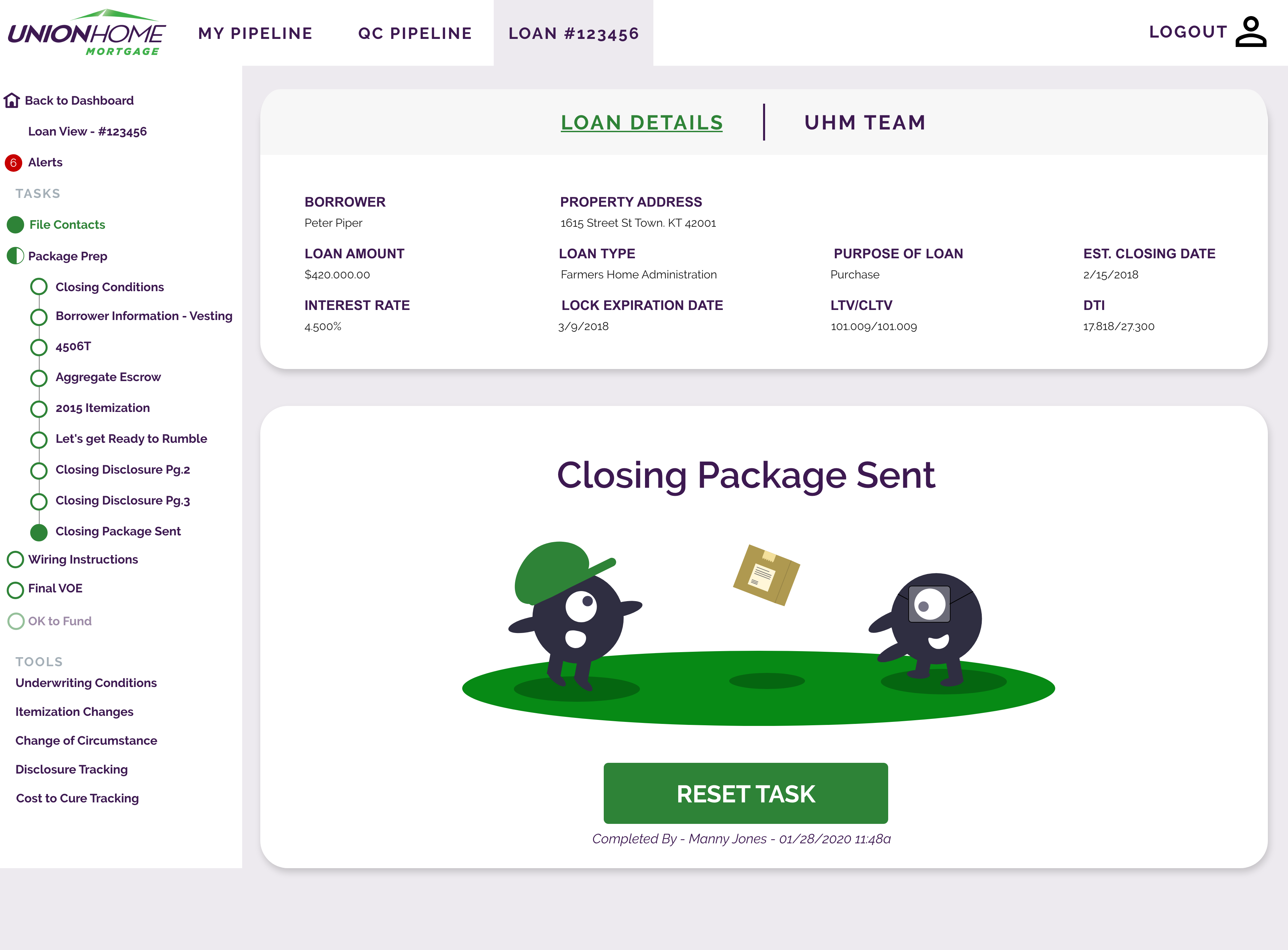
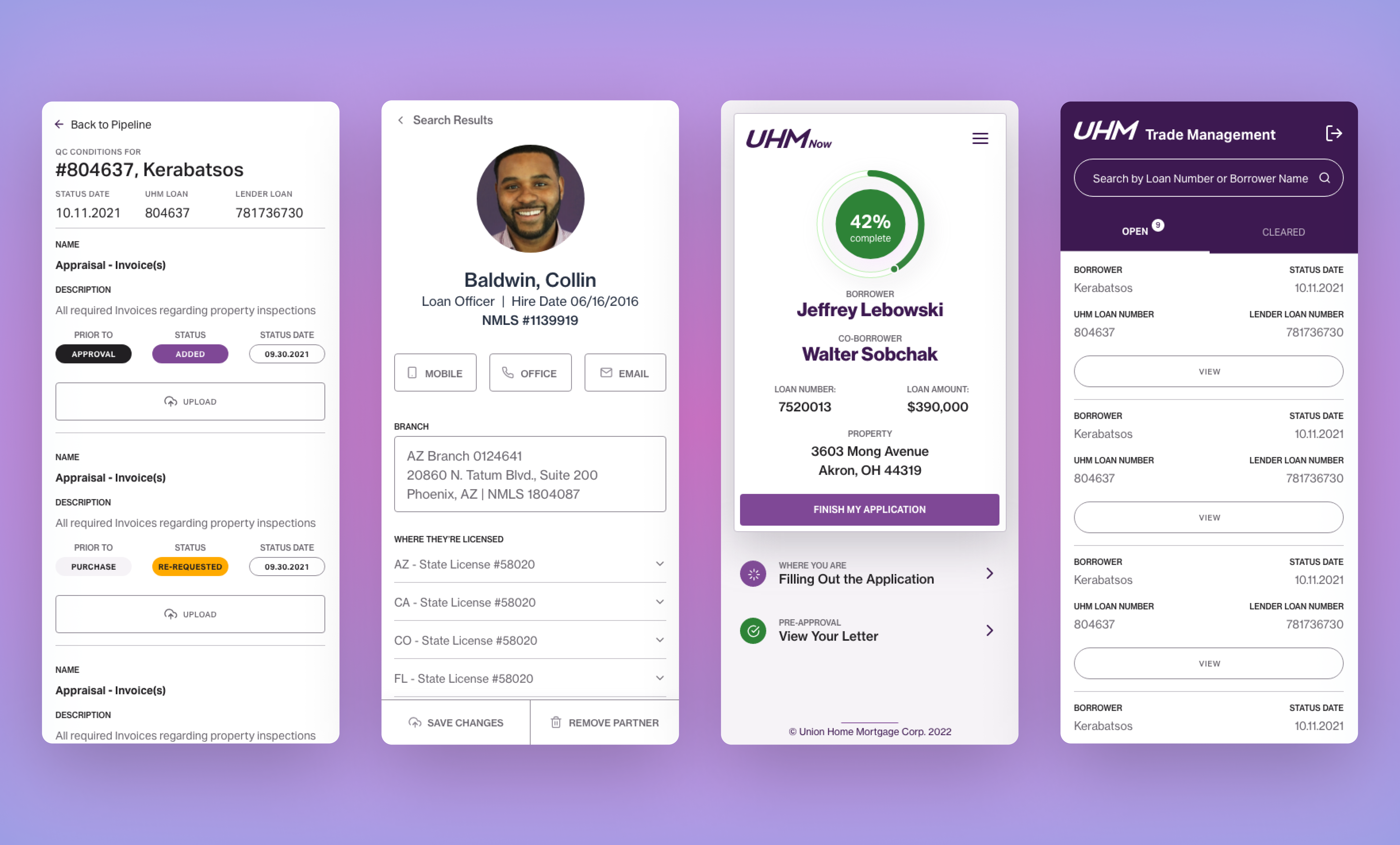
This clear structure made the applications easier to build, and easier to use.
Shared components reduced the need to recreate patterns across applications, improving efficiency and alignment.
Layouts and hierarchy became more predictable, making interfaces easier to scan and understand while creating a more cohesive experience across tools that had previously felt disconnected.
The team could now move faster without sacrificing usability.
With a shared system in place, new applications could be built more efficiently and with greater consistency.
The experience became easier to navigate and more reliable for internal users, while reducing the effort required from the team to design and build each new tool.
Clear structure made the applications easier to build and easier to use.
Shared components reduced the need to recreate patterns across applications, improving efficiency and alignment.
Layouts and hierarchy became more predictable, making interfaces easier to scan and understand while creating a more cohesive experience across tools that had previously felt disconnected.